Plinko
 Resources for this lesson:
> Glossary ![]()
> Calculator Resources ![]()
> Teacher Resources: Instructional Notes ![]()
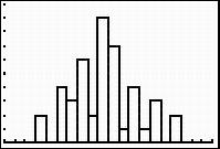
Andrew’s plot of his winning values is shown below.
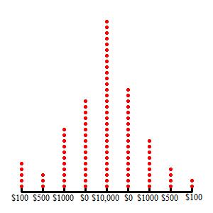
Did your table resemble Andrew’s plot? The more times you play the game, the more your table will resemble Andrew’s plot.
Statistically speaking, the more trials that are conducted, the trials will average to the mean of the data. Let’s look at another example to make this idea more clear since the Plinko scale is not a mathematically correct scale.
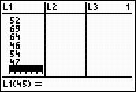
 Khalid and Andrew decide to revisit data on the presidents of the United States since there are a large number of presidents in that data set. The boys decide to examine the ages of the presidents at their first inauguration.
President |
Age at Inauguration |
|---|---|
1. G. Washington |
57 |
2. J. Adams |
61 |
3. T. Jefferson |
57 |
4. J. Madison |
57 |
5. J. Monroe |
58 |
6. J. Q. Adams |
57 |
7. A. Jackson |
61 |
8. M. Van Buren |
54 |
9. W. H. Harrison |
68 |
10.J. Tyler |
51 |
11.J. Polk |
49 |
12. Z. Taylor |
64 |
13. M. Fillmore |
50 |
14. F. Pierce |
48 |
15. J. Buchanan |
65 |
16. A. Lincoln |
52 |
17. A. Johnson |
56 |
18. U. Grant |
46 |
19. R. Hayes |
54 |
20. J. Garfield |
49 |
21. C. Arthur |
51 |
22. G. Cleveland |
47 |
23. B. Harrison |
55 |
24. G. Cleveland |
55 |
25. W. McKinley |
54 |
26. T. Roosevelt |
42 |
27. W. H. Taft |
51 |
28. W. Wilson |
56 |
29. W. Harding |
55 |
30. C. Coolidge |
51 |
31. H. Hoover |
54 |
32. F. D. Roosevelt |
51 |
33. H. Truman |
60 |
34. D. Eisenhower |
62 |
35. J. F. Kennedy |
43 |
36. L. Johnson |
55 |
37. R. Nixon |
56 |
38. G. Ford |
61 |
39. J Carter |
52 |
40. R. Reagan |
69 |
41. G. H. Bush |
64 |
42. W. Clinton |
46 |
43. G. W. Bush |
54 |
44. B. Obama |
47 |
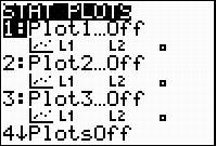
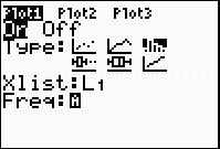
Khalid and Andrew will be using their graphing calculator to generate a histogram. The steps that Khalid and Andrew follow to construct a histogram using a graphing calculator are shown below. Produce the same histogram on your graphing calculator by following the given directions.
- Enter the data into your graphing calculator. Be sure to include President Obama.
- Turn on the first STAT PLOT and select the histogram icon.
- Adjust the WINDOW as shown.
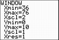
- GRAPH the histogram.