Which Model Makes Sense?
 Resources for this lesson:
> Glossary ![]()
> Calculator Resources ![]()
> Teacher Resources: Instructional Notes ![]()
Did you confirm that a linear model was the best fit for the data? Compare your response with the solution below:
Velocity of Projectile vs. Time
| Time (seconds) |
0 |
0.5 |
1 |
1.5 |
2 |
2.5 |
3 |
|---|---|---|---|---|---|---|---|
Velocity (feet per second) |
49 |
34 |
19 |
2.5 |
−14 |
−30.5 |
−45 |
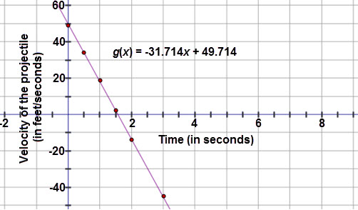
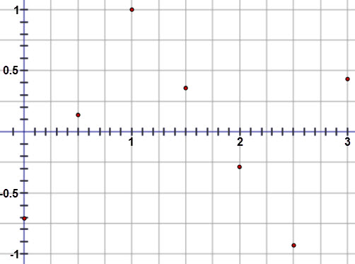
The graph of the linear regression equation fits the scatter plot very well. The residuals are all fairly small and the graph of the residuals is random. The correlation coefficient when rounded to the nearest thousandth was negative 1, which indicates that there is a strong negative linear correlation between the variables. All of these facts indicate that a linear model is appropriate for the velocity versus time data.