Sneaking Statistics
 Resources for this lesson:
> Glossary ![]()
> Calculator Resources ![]()
> Teacher Resources: Instructional Notes ![]()
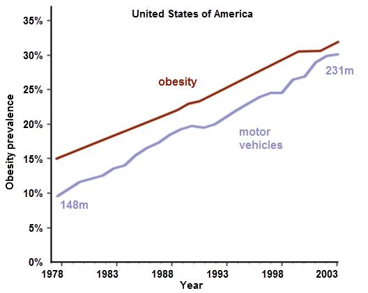
Now, look at this graph…
Source: Man's Greatest Mistake ![]()
Licensed under a Creative Commons Attribution 2.0 UK: England & Wales License. ![]()
Can you spot what is misleading?
This graph comes from a statistical study aimed at finding causes for obesity. The graph clearly shows that as the number of motor vehicle rises, so does obesity. These two curves have almost the exact same rate of change!
The author uses this graph to make the claim that a rise in vehicles is causing the rise in obesity. This is another common misuse of statistics. There is an association between the rise in obesity and the rise in motor vehicles. However, nothing about this data shows or proves that the one causes the other.
Remember, association does not imply causation. From the graph, there appears to be an association between the rise in motor vehicles and a rise in obesity. They appear associated because the slopes of the lines are almost identical. Deeper research and experimentation must be done once an association is noticed to prove that the rise in motor vehicles caused the rise in obesity.