Skip to section navigation Skip to main content

A Good Enough Fit?

head shot of andrewAndrew drew the line of best fit on his scatter plot:


This graph is a scatter plot displaying the winning times (in minutes) for the Boys 2A Cross Country state championship for years 2007 to 2012.  The horizontal axis is labeled ‘Years since 2007’ and extends from negative 1 to 7.  The vertical axis is labeled ‘Winning times (in minutes)’ and extends from negative 2 to 22.  The graph displays the following ordered pairs:  (0, 16.33), (1, 16.77), (2, 17.5), (3, 16.77), (4, 16.35), and (5, 16.42).  A line of best fit is drawn through the scatter plot, modeled with the linear regression equation g of x = negative 0.044x +16.8.

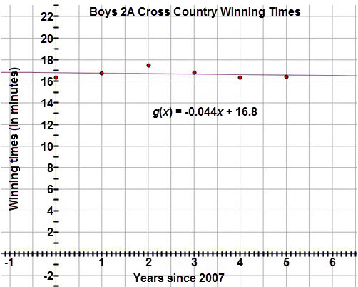
From the graph, Andrew thinks that a linear function fits the data fairly well.  Yet, inspecting the graph alone does not guarantee that the model is in fact the best for the data.


< Previous Next >