Student Resources
Calculator Resources
Texas Instrument calculators TI-83 and TI-84 are recommended for completing the activities in this module. The following guides are based on the operation of the TI-83 and TI-84 models.
For accessibility, the TI-84 Plus with the Orion add-on is recommended.
> Entering Data into Lists
> Creating a Scatter Plot
> Linear Regression
> Graphing a Regression Equation
> Residuals
Online Graphing Resources
> Shodor Applet ![]()
> Desmos Graphing Calculator ![]()
> Cubic Function Explorer ![]()
> Graphical Function Explorer ![]()
Entering Data into Lists
In math class, you may be asked to analyze and graph a set of real-world data. When you have a set of real-world data, first you must enter the data into lists in your graphing calculator.
First, make sure your lists are clear. Press
![]()
![]()
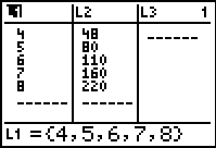
If your lists are not clear, such as this list:
Go to the top of each list by using the
up arrow and press
![]()
![]()
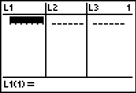
Repeat for each list that has data until
all lists are empty.
Note: If you accidentally delete a list, press:
![]()
![]()
![]()
Now, we will enter the data below into the graphing calculator:
Year |
0 |
1 |
2 |
4 |
9 |
Height of Tree (feet) |
2 |
3.5 |
5.5 |
7.5 |
12 |
Since the independent variable is the year, we will enter the year values into L1. The dependent variable (height of tree) values should be entered into L2.
Press
![]()
![]()
![]()
![]()
![]()
![]()
![]()
![]()
![]()
![]()
Now press
![]()
![]()
![]()
![]()
![]()
![]()
![]()
![]()
![]()
![]()
![]()
![]()
![]()
![]()
![]()
![]()
![]()
![]()
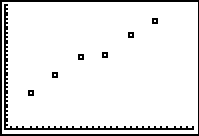
Creating a Scatter Plot
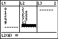
Using the cost of milk data from the last practice section, we will now view the graph of the scatter plot using the graphing calculator.
Your list screen should look like this:
To return to the main screen, press
![]()
![]()
 Then press
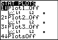
![]()
![]()
Select 1: Plot 1
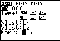 Now press the following to match the
screen to the right:
![]()
![]()
![]()
![]()
![]()
![]()
![]()
![]()
![]()
Now, you must adjust the window to view the graph. According to your data, the years are from 0-6 and the cost of milk range from 1.37 to 1.48, so press:
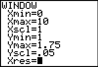
![]()
![]()
![]()
![]()
![]()
![]()
![]()
![]()
![]()
![]()
![]()
![]()
![]()
![]()
![]()
![]()
![]()
![]()
![]()
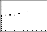
Now press
![]()
If you are not happy with the window, you can always return to the window screen and adjust the values for maximum, minimum, or scale values.
When you are finished viewing the graph and ready to return to the main screen, press
![]()
![]()
Linear Regression
Since most of the data we encounter in the real-world is not perfect, it is often hard to find an equation to fit the data perfectly. If the data seems to follow a somewhat linear pattern, we need to find the equation for the line of best fit. To do this we use the linear regression function on the graphing calculator.
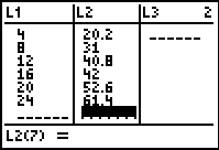
Using the tree growth data from the last practice section, we will now determine the equation for the line of best fit.
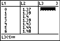
Your list should have the following:
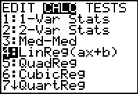
Now press
![]()
![]()
![]()
![]()
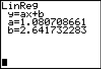
The screen to the right shows the linear
regression equation. The slope of the line is
the a-value and the y-intercept of the line is
the b-value. To write the equation for line of
best fit, always round to at least three decimal
places: y = 1.081x + 2.642. .
When finished, you can clear your main screen by pressing
![]()
Graphing a Regression Equation
It is important to look at the graph of the regression equation on the same grid as the scatter plot to see just how well the graph of the regression equation fits the scatter plot.
We will use the Mass of the Pennies data to illustrate the steps for displaying the graph of a regression equation on the same grid as a scatter plot.
Your list should look like this:
Now adjust your window to match
the following:
When finished, press
![]()
Recall that the next step in this process involves calculating the regression equation for the data. Since the Mass of the Pennies data appears to be linear we will use the steps below to determine the linear regression equation for this data.
Press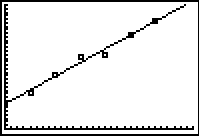
Your linear regression equation should reappear.
Now to view the graph, press
![]() .
.
This linear regression equation seems to be a good fit, as most of the data points are either touching the line or are close to the line.
Residuals
Once you have found a regression equation you can calculate the residuals. First display the residual list in L3.
![]()
![]()
![]()
![]()
![]() 8
8 ![]()
Next, graph the residual plot:
![]()
![]()
![]()
Change the Ylist to Resid:
![]()
![]()
![]()
![]()
![]()
Press the ![]() key until you see Resid,
key until you see Resid,
then press![]()
To adjust the window of the graph, press
![]()
![]()