Just How Normal Are You?
 Resources for this lesson:
You will use your Algebra II Journal ![]() on this page.
on this page.
> Glossary ![]()
> Calculator Resources ![]()
> Teacher Resources: Instructional Notes ![]()
Andrew and Khalid are discussing what they have learned so far about the presidents.
 Andrew: We have looked at the presidents’ ages and their heights. We have looked at how long the presidents have served. What haven’t we studied about the presidents?
 Khalid: Well, we haven’t looked at the presidents’ weight!
The table below displays the weights of the presidents.
President |
Weight (pounds) |
|---|---|
1. G. Washington |
175 |
2. J. Adams |
150 |
3. T. Jefferson |
174 |
4. J. Madison |
100 |
5. J. Monroe |
189 |
6. J. Q. Adams |
174 |
7. A. Jackson |
140 |
8. M. Van Buren |
173 |
9. W. H. Harrison |
139 |
10. J. Tyler |
141 |
11. J. Polk |
174 |
12. Z. Taylor |
170 |
13. M. Fillmore |
164 |
14. F. Pierce |
144 |
15. J. Buchanan |
198 |
16. A. Lincoln |
180 |
17. A. Johnson |
174 |
18. U. Grant |
156 |
19. R. Hayes |
170 |
20. J. Garfield |
184 |
21. C. Arthur |
224 |
22. G. Cleveland |
260 |
23. B. Harrison |
150 |
24. G. Cleveland |
260 |
25. W. McKinley |
199 |
26. T. Roosevelt |
210 |
27. W. H. Taft |
316 |
28. W. Wilson |
170 |
29. W. Harding |
173 |
30. C. Coolidge |
147 |
31. H. Hoover |
187 |
32. F. D. Roosevelt |
188 |
33. H. Truman |
167 |
34. D. Eisenhower |
171 |
35. J. F. Kennedy |
173 |
36. L. Johnson |
200 |
37. R. Nixon |
175 |
38. G. Ford |
190 |
39. J. Carter |
160 |
40. R. Reagan |
185 |
41. G. H. Bush |
196 |
42. W. Clinton |
223 |
43. G. W. Bush |
191 |
44. B. Obama |
180 |
 Check Your Understanding
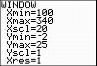
Use the graphing calculator to construct a histogram of the data. Shown below is a suggested WINDOW to use for graphing the histogram in the calculator. Remember to use President Cleveland’s weight only once.
 Check Your Understanding
Show AnswerHide Answer
 A histogram of the Weights of the Presidents is shown. The x axis is labeled Weights of Presidents, and it is numbered from 135 to 270, counting in increments of 5. The y axis is labeled Frequency and is numbered from zero to 8 counting in increments of 1. The histogram is skewed left, with the highest bar between 165 and 175. The highest bar reaches a frequency of 6. There is a gap between 225 and 260.
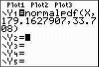
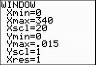
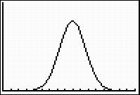
Use the mean and standard deviation you calculated to sketch the normal curve for this normal distribution. (You may use the features of the graphing calculator to construct a normal distribution for this data if you feel comfortable with the calculator’s features. Be sure to adjust your window appropriately.)
 Check Your Understanding
Show AnswerHide Answer
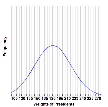 A bell shaped normal curve is shown. The x axis extends from 105 to 270, with the peak of the bell at 180. The x axis is labeled Weights of Presidents and the y axis is labeled Frequency.
Compare and contrast the normal distribution with the histogram.
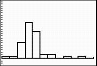 |
 |
President’s Weights |
Normal Distribution |
What do you notice?
You should notice that the weights are most definitely not normally distributed! The weights of the heavier presidents, such as President Taft, skew the data to the right.
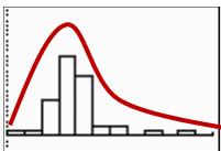
This data set is a reminder: While many data sets follow a normal distribution, many do not! As you continue your work with data distributions, mean and standard deviation, remember this important fact. Normal distributions are special, and not all data sets are normal.
 Algebra II Journal: Reflection 3
In this lesson, you used the mean and standard deviation of a data set to fit the data to a normal distribution and to estimate percentages using the normal distribution.
Respond to the following reflection questions in your Algebra II Journal ![]() and submit to your teacher.
and submit to your teacher.
- Why are normal distributions important to statistics?
- Why do some data sets follow normal distributions and some do not? Refer to the presidents’ weight data to support your answer.
< Previous
> Go to Home Page
> Go to next lesson: X…Y…Zzzzzzz


