Skip to section navigation Skip to main content

A Deeper Look at Exponential Functions

Test and Confirm

Examine the exponential curve of best fit on the scatter plot:

This graph is a scatter plot displaying the growth of bacteria over the period of twenty-five minutes.  The graph is titled 'Bacteria Growth.'  The horizontal axis is labeled 'Time (in minutes) and extends from negative 3 to 28.  The vertical axis is labeled 'Number of Bacteria' and extends from negative 5 to 60.  The graph displays the following ordered pairs:  (0, 30), (5, 34), (10, 40), (15, 45), (20, 52), and (25, 60).  The curve defined by function g of x = 29.892 times 1.028 to the power of x is drawn through the scatter plot.

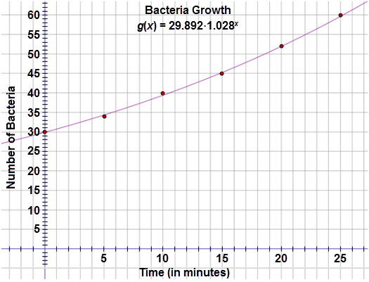
The graph appears to pass through most of the points.  Now examine the residual plot:

This graph is a residual plot displaying the residuals for the bacteria growth when an exponential regression equation is applied to the data.  The horizontal axis represents the time (in minutes) and extends from negative 1 to 28.  The vertical axis represents the residual values and extends from negative 0.7 to 1.8.  The graph displays the following ordered pairs:  (0, 0.103), (5, negative 0.349), (10, 0.536), (15, negative 0.34), (20, negative 0.091), and (25, 0.153).

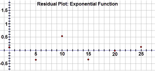
Inspection of the residuals reveals that these values are very small and in a random pattern, confirming that this is the best fit for the data set.

Let’s examine each model on the scatter plot.  Notice that exponential curve almost touches each of the data points.  The linear model has greater gaps between the curve and some of the data points.

This graph is a scatter plot displaying the growth of bacteria over the period of twenty-five minutes.  The graph is titled 'Bacteria Growth.'  The horizontal axis is labeled 'Time (in minutes) and extends from negative 3 to 28.  The vertical axis is labeled 'Number of Bacteria' and extends from negative 5 to 60.  The graph displays the following ordered pairs:  (0, 30), (5, 34), (10, 40), (15, 45), (20, 52), and (25, 60).  The curve defined by function g of x = 29.892 times 1.028 to the power of x is drawn through the scatter plot. The linear regression equation y equals 1.194 x plus 28.571 is graphed on the scatter plot.

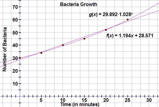
When you compare the residual plots side by side, notice that the residuals for the exponential model are much smaller than the linear model. This provides further evidence that the exponential model is in fact the better fit.


< Previous Next >