Skip to section navigation Skip to main content

Modeling With Trigonometric Functions

Test and Confirm

Let’s examine the curve of best fit:

This graph is a scatter plot displaying the average low temperatures for San Diego over the period of twelve months.  The graph is titled ‘San Diego Average Low Temperatures.’  The horizontal axis is labeled ‘Months since January’ and extends from  negative 2 to 13.  The vertical axis is labeled ‘Average Low Temperature (in degrees Fahrenheit)’ and extends from  negative 10 to 80.  The graph displays the following ordered pairs:  (0, 48), (1, 51), (2, 53), (3, 56), (4, 59), (5, 62), (6, 65), (7, 67), (8, 65), (9, 61), (10, 54) and (11, 48).  The curve defined by function f of x = 8.839 times the sine of the quantity 0.519x minus 1.765 end quantity plus 57.339 is drawn through the scatter plot.

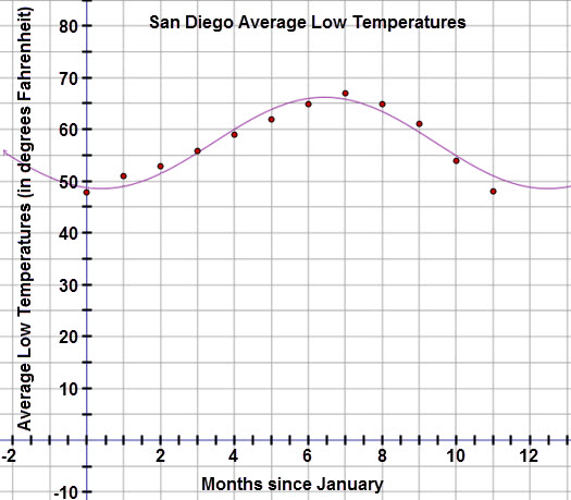
The graph appears to pass through most of the points.   To confirm the model is appropriate, examine the residual plot below.

This graph is a residual plot displaying the residuals for the San Diego Average Low Temperatures when a sinusoidal regression equation with four iterations is applied to the data.  The horizontal axis represents months since January and extends from negative 0.5 to 12.  The vertical axis represents the residual values and extends from negative 4 to 4.  The graph displays the following ordered pairs:  (0, negative 0.67), (1, 2.04), (2, 1.55), (3, 0.51), (4, negative 1.02), and (5, negative 1.84), (6, negative 0.95), (7, 1.2), (8, 1.58), (9, 1.55), (10, negative 0.91), and (11, negative 3.02).

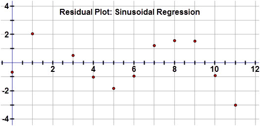
Inspection of the residuals reveals that these values are very small and in a random pattern, confirming that this is the best fit for the data set.

Apply the Model

Now, use the curve of best fit to make the following predictions:

Check Your Understanding


< Previous Next >