Skip to section navigation Skip to main content

Modeling With Trigonometric Functions

Test and Confirm

Let’s examine the curve of best fit:

This graph is a scatter plot displaying the average high temperatures for Boston over the period of twelve months.  The graph is titled ‘Boston High Temperatures.’  The horizontal axis is labeled ‘Months since January’ and extends from negative 2 to 13.  The vertical axis is labeled ‘Average Monthly High Temperatures (in degrees Fahrenheit)’ and extends from negative 10 to 90.  The graph displays the following ordered pairs:  (0, 36), (1, 39), (2, 45), (3, 56), (4, 66), (5, 76), (6, 82), (7, 80), (8, 72), (9, 62), (10, 51) and (11, 42).

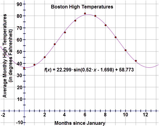
The model passes through most of the points and appears to be a good fit.  To verify that the model is appropriate, examine the residual plot below:

This graph is a residual plot displaying the residuals for the Boston High Temperatures when a sinusoidal regression equation is applied to the data.  The horizontal axis represents the months since January and extends from negative 0.5 to 12.  The vertical axis represents the residual values and extends from negative 1.5 to 2.  The graph displays the following ordered pairs:  (0, negative 0.656), (1, 0.826), (2, negative 0.137), (3, 0.294), (4, negative 1.085), (5, negative 0.267), (6, 1.176), (7, 0.448), (8, negative 0.787), (9, negative 0.318), (10, 0.089), and (11, 0.417).

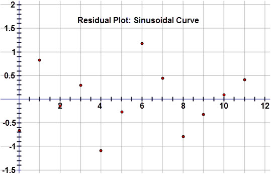
The residuals are random and fairly close to zero.  So, this model is appropriate and may be used to predict future values.

Apply the Model

Use the curve of best fit to answer the following:

Check Your Understanding


< Previous Next >