Skip to section navigation Skip to main content

Plinko

Resources for this lesson:

Key Terms

Normal Curve
Density Curve

> Glossary opens in new window
> Calculator Resources opens in new window
> Teacher Resources: Instructional Notes opens in new window

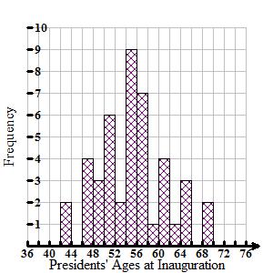
You should arrive at a graph similar to Khalid’s and Andrew’s, shown below.

This is a bar graph displaying the frequency of the presidents’ ages at inauguration. The horizontal axis is labeled ‘Presidents’ Ages at Inauguration’, and extends from 36 to 76. The vertical axis is labeled ‘Frequency’ and extends from 0 to 10. The first bar covers the age range 42 to 44 years and has a frequency of 2. The next bar covers the range of 46 to 48 years and has a frequency of 4. The next bar covers the range 48 to 50 years and has a frequency of 3. The next bar covers the range 50 to 52 years and has a frequency of 6. The next bar covers the range 52 to 54 years and has a frequency of 2. The next bar covers the range 54 to 56 years and has a frequency of 9. The next bar covers the range 56 to 58 years and has a frequency of 7. The next bar covers the range 58 to 60 years and has a frequency of 1. The next bar covers the range 60 to 62 years and has a frequency of 4. The next bar covers the range 62 to 64 years and has a frequency of 1. The next bar covers the range 64 to 66 years and has a frequency of 3. The last bar covers the range 68 to 70 years and has a frequency of 2.

Real-Life Scenarios


> Text version for animation opens in new window


< Previous Next >