Plinko
 Resources for this lesson:
![]() Key Terms
Key Terms
Normal Distribution
> Glossary ![]()
> Calculator Resources ![]()
> Teacher Resources: Instructional Notes ![]()
The Presidents’ Ages histogram is a normal distribution. The normal curve drawn above the distribution is single peaked. It is symmetric about that peak and has a bell shape.
Return to the presidents’ ages at inauguration.
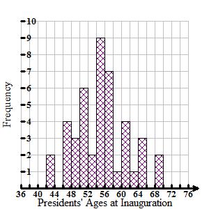
Presidents' AgesHide Answer
 1: G. Washington, 57.
2: J. Adams, 61.
3: T. Jefferson, 57.
4: J. Madison, 57.
5: J. Monroe, 58.
6: J. Q. Adams, 57.
7: A. Jackson, 61.
8: M. Van Buren, 54.
9: W. H. Harrison, 68.
10: J. Tyler, 51.
11: J. Polk, 49.
12: Z. Taylor, 64.
13: M. Fillmore, 50.
14: F. Pierce, 48.
15: J. Buchanan, 65.
16: A. Lincoln, 52.
17: A. Johnson, 56.
18: U. Grant, 46.
19: R. Hayes, 54.
20: J. Garfield, 49.
21: C. Arthur, 51.
22: G. Cleveland, 47.
23: B. Harrison, 55.
24: G. Cleveland, 55.
25: W. McKinley,54.
26: T. Roosevelt, 42.
27: W. H. Taft, 51.
28: W. Wilson, 56.
29: W. Harding, 55.
30: C. Coolidge, 51.
31: H. Hoover, 54.
32: F. D. Roosevelt, 51.
33: H. Truman, 60.
34: D. Eisenhower, 62.
35: J. F. Kennedy, 43.
36: L. Johnson, 55.
37: R. Nixon, 56.
38: G. Ford, 61.
39: J. Carter, 52.
40: R. Reagan, 69.
41: G. H. Bush, 64.
42: W. Clinton, 46.
43: G. W. Bush, 54.
44: B. Obama, 47.
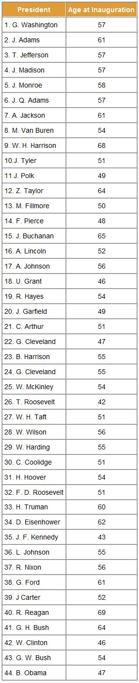
1: G. Washington, 57.
2: J. Adams, 61.
3: T. Jefferson, 57.
4: J. Madison, 57.
5: J. Monroe, 58.
6: J. Q. Adams, 57.
7: A. Jackson, 61.
8: M. Van Buren, 54.
9: W. H. Harrison, 68.
10: J. Tyler, 51.
11: J. Polk, 49.
12: Z. Taylor, 64.
13: M. Fillmore, 50.
14: F. Pierce, 48.
15: J. Buchanan, 65.
16: A. Lincoln, 52.
17: A. Johnson, 56.
18: U. Grant, 46.
19: R. Hayes, 54.
20: J. Garfield, 49.
21: C. Arthur, 51.
22: G. Cleveland, 47.
23: B. Harrison, 55.
24: G. Cleveland, 55.
25: W. McKinley,54.
26: T. Roosevelt, 42.
27: W. H. Taft, 51.
28: W. Wilson, 56.
29: W. Harding, 55.
30: C. Coolidge, 51.
31: H. Hoover, 54.
32: F. D. Roosevelt, 51.
33: H. Truman, 60.
34: D. Eisenhower, 62.
35: J. F. Kennedy, 43.
36: L. Johnson, 55.
37: R. Nixon, 56.
38: G. Ford, 61.
39: J. Carter, 52.
40: R. Reagan, 69.
41: G. H. Bush, 64.
42: W. Clinton, 46.
43: G. W. Bush, 54.
44: B. Obama, 47.
 Check Your Understanding
Because the data is representing the entire population of presidents, the symbol μ (“mu”) is used to represent the mean, instead of (x). A lower case "m" from the Greek alphabet is represented by the symbol μ. This symbol is used for the mean when the data for an entire population is used Thus, you found the mean for the presidents’ ages to be μ = 54.659.
Notice that the arrow that points to the mean also points to the peak of the normal curve.
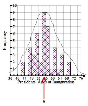
You should further notice that approximately half of the bars (half of the data) fall below the mean, and half of the bars (half of the data) falls above the mean. This is what is meant by the curve being symmetric. This is an important characteristic of a normal curve.
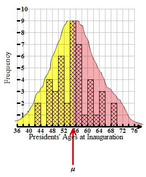
In a perfect normal distribution, the mean is exactly in the middle of the data. In a perfect normal distribution, exactly half the data falls below the mean, and exactly half the data falls above the mean. (The mean and the median are exactly equal.)


