Sneaking Statistics
 Resources for this lesson:
> Glossary ![]()
> Calculator Resources ![]()
> Teacher Resources: Instructional Notes ![]()
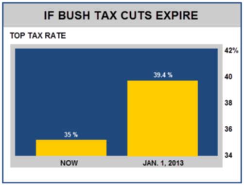
Here is an example of a graphic that can be misleading.

Do you notice how much is wrong with this graph?
Show AnswerHide Answer
Here is a list of how this graph is misleading:
• All the numbers and labels on the graph are purposely made fuzzy and difficult to read.
• The vertical axis does not start at zero.
• The scales are not labeled, so it is not clear what the percentages are trying to show.
• The "NOW" bar is 35%, and the "Jan. 1, 2013" bar is 39.4%. This is only a 4.4% difference, yet the January bar is five times as tall as the bar on the left.
• The numbers above the bar are made small and purposely fuzzy so they would be difficult to read. Thus, the viewer's eyes are drawn to the misleading size of the bars.
The graph above makes a common "misleading" error, which is to make the axes not start at zero so the graph is distorted.


