X…Y…Zzzzzzz
 Resources for this lesson:
> Glossary ![]()
> Calculator Resources ![]()
> Teacher Resources: Instructional Notes ![]()
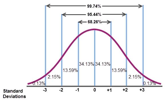
Here is the distribution of the normal curve you are familiar with.
The graphing calculator can graph normal distributions and it will provide the different percentiles to which Justyce refers. (This, of course, makes our friend Khalid very happy.)
Let’s use the data from the beginning of this lesson, which states that the ages of the presidents at inauguration form a normal distribution with a mean of μ = 54.659 and a standard deviation of  = 6.186.
To obtain a graph of a normal distribution, follow these steps using the graphing calculator:
 Check Your Understanding
Graphing a Normal Distribution
Click on a box to see the answer.
STEP ONEPress Y =
STEP TWOPress the 2nd button, then VARS (to activate DISTR)
STEP THREESelect 1: normalpdf(
STEP FOUR
Enter in the following information in the parenthesis: (x, mean, standard deviation). See the screen shot below.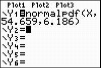
Adjust your WINDOW to display the graph. For the presidential data, use the WINDOW shown below.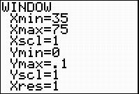
Now, press GRAPH to view the normal curve.
 Before we continue with analyzing the data, let’s discuss why the window should be set like this. The Xmin and Xmax correspond to the presidents’ minimum and maximum ages.
The normal curve is always above the x-axis, so the Ymin is always 0. The y-axis is the frequency, or number of times, the different ages showed up in the data. This is now a percentage, and not a whole number. A formula that can be used to determine the Ymax value for the Window is

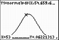 For example, press TRACE after graphing the normal curve. The x-values that appear are the various ages of the presidents at inauguration. The corresponding y-values are the percentage of presidents that were at that age at inauguration.
Type in 53 and hit ENTER. The y-value you get is 0.062. This means that (approximately) 6.2% of the presidents were 53 years old at inauguration.
 Real-Life Scenarios
> Text version for animation
Check Your Understanding