Skip to section navigation Skip to main content

A Good Enough Fit?

Create and Analyze

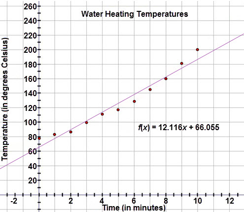
Let’s help Marissa analyze a linear fit.  Examine Marissa’s graph and equation for line of best fit shown below: 

This graph is a scatter plot displaying the water heating temperatures (in degrees Celsius) experiment data.  The horizontal axis is labeled ‘Time (in minutes)’ and extends from negative 2 to 12.  The vertical axis is labeled ‘Temperature (in degrees Celsius)’ and extends from negative 10 to 260.  The graph displays the following ordered pairs:  (0, 78), (1, 83), (2, 87), (3, 99.4), (4, 111.2), (5, 118.4), (6, 129.2), (7, 145.4), (8, 160.2), (9, 180.8), (10, 200.4).  A line of best fit is drawn through the scatter plot, modeled with the linear regression equation f of x = 12.116x + 66.055.


Check Your Understanding


< Previous Next >