Skip to section navigation Skip to main content

Which Model Makes Sense?

Compare your response with the solution below:

Create and Analyze

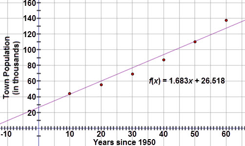
  1. Upon initial inspection, a linear model appears to be a good fit.

This graph is a scatter plot displaying the town populations (in thousands) for years 1950 to 2010.  The horizontal axis is labeled ‘Years since 1950’ and extends from negative 10 to 65.  The vertical axis is labeled ‘Town Population (in thousands)’ and extends from negative 10 to 160.  The graph displays the following ordered pairs:  (10, 44.2), (20, 55.5), (30, 69.1), (40, 87.2), (50, 110.1), and (60, 137.8).  A line of best fit is drawn through the scatter plot, modeled with the linear regression equation f of x = 1.683x + 26.518.


Test and Confirm

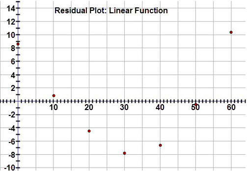
  1. The correlation coefficient is 0.981 and the scatter plot looks fairly linear.  However, when examining the residual plot, there is a clear pattern to the residuals, meaning that a linear model is not the best fit.

This graph is a residual plot displaying the residuals for the town population (in thousands) when a linear regression equation is applied to the data.  The graph is titled ‘Residual Plot: Linear Function.’  The horizontal axis represents the years since 1950 and extends from negative 5 to 65.  The vertical axis represents the residual values and extends from  negative 10 to 14.  The graph displays the following ordered pairs:  (0, 8.68), (10, 0.85), (20, negative 4.68), (30,  negative 7.91), (40,  negative 6.65), (50,  negative 0.58), (60, 10.29).


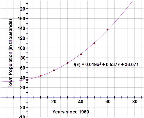
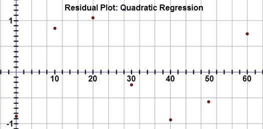
  1. While the quadratic curve seems to fit the data well, the residual plot reveals a clear pattern. This indicates that a quadratic model is not the best fit.
  2. This graph shows a scatter plot for a quadratic regression. The x-axis represents the years since 1950 and has scale from -10 to 80.  The y-axis represents town population (in thousands) and has a scale from -20 to 160. The scatter plot includes points (0, 35.2), (10, 44.2), (20, 55.5), (30, 69.1), (40, 87.2), (50, 110.1), and (60, 137.8). The quadratic regression curve defined by f(x) = 0.019x2 + 0.537x + 36.071 is graphed on the scatter plot


    This graph is a residual plot for the quadratic regression equation. The scale for the x-axis is from 0 to 60. The y-axis scale is from -1 to 1. The residuals include points (0, -0.87), (10, 0.85), (20, 1.05), (30, -0.27), (40, -0.91), (50, -0.58), (60, 0.74).

  3. Since the data is continuing to increase, the only other model that makes sense is an exponential model.  The exponential curve of best fit equation is y = 35.156(1.023)x.

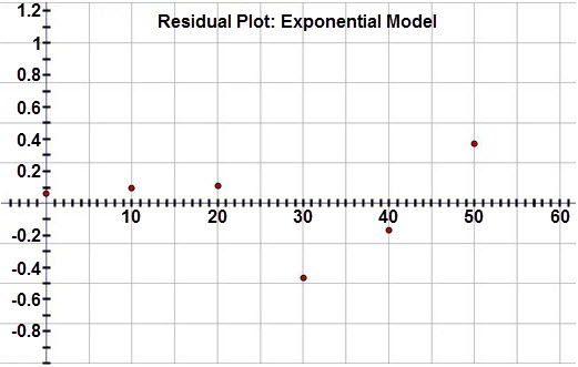
The residuals for the exponential model are:

Years since 1950

0

10

20

30

40

50

60

Residual value (in thousands)

0.080

0.093

0.106

−0.469

−0.172

0.369

−0.011

The residual graph is random and close to zero, confirming that the exponential model is a good fit for the data.

This graph is a residual plot displaying the residuals for the town population (in thousands) when an exponential regression equation is applied to the data.  The graph is titled ‘Residual Plot: Exponential Model.’  The horizontal axis represents the years since 1950 and extends from negative 5 to 65.  The vertical axis represents the residual values and extends from negative 1 to 1.2.  The graph displays the following ordered pairs:  (0, 0.04), (10, 0.06), (20, 0.08), (30, negative 0.48), (40, negative 0.16), (50, 0.42), (60, 0.10).

It appears that an exponential model is the best fit for this data set.

< PreviousNext >